
Considering value judgements in identifying beauty?

Over the last few days I’ve been thinking about the value judgements that are intrinsic within an artistic practice, we don’t generally think that everything is lovely all the time. In my case far from it! It’s hard to not add a value to a new piece of work or a whole series, there is something encoded in our minds that helps to make a decision about what we see in front of us.
When I was producing multiple sets as part of the Petri Latex series (images below), I found that my feeling about a set influenced my decision making – particularly in terms of which sets would be used as part of a lightbox or in an installation. There seem to be multiple considerations including colour, form, and colour interaction being some of the more simple; to then considering embedded movement, visible energy and depth being more difficult to pin down.

Petri Latex 2015 series, set 37-48 (left) - used in freestanding lightbox
Petri Latex 2015 series, set 97-108 (right) - unused to date
Finding the space to document
Most recently I’ve been looking at some of the undocumented Abstracted 35 source images, of which there are several, and trying to understand why they were left on the metaphorical shelf losing in the fight for my attentions. The series is relatively new, something started in 2020, so I’m very much in a learning phase, considering how I can bring diversity and ‘newness’ to each new series.
Unlike using petri dishes which encourage rotational movement, working on a flat acetate sheet needs more effort to bring things together. In these works, I’m not considering the whole, ie. the full acetate sheet, looking instead for small sections that might be interesting when blown up.

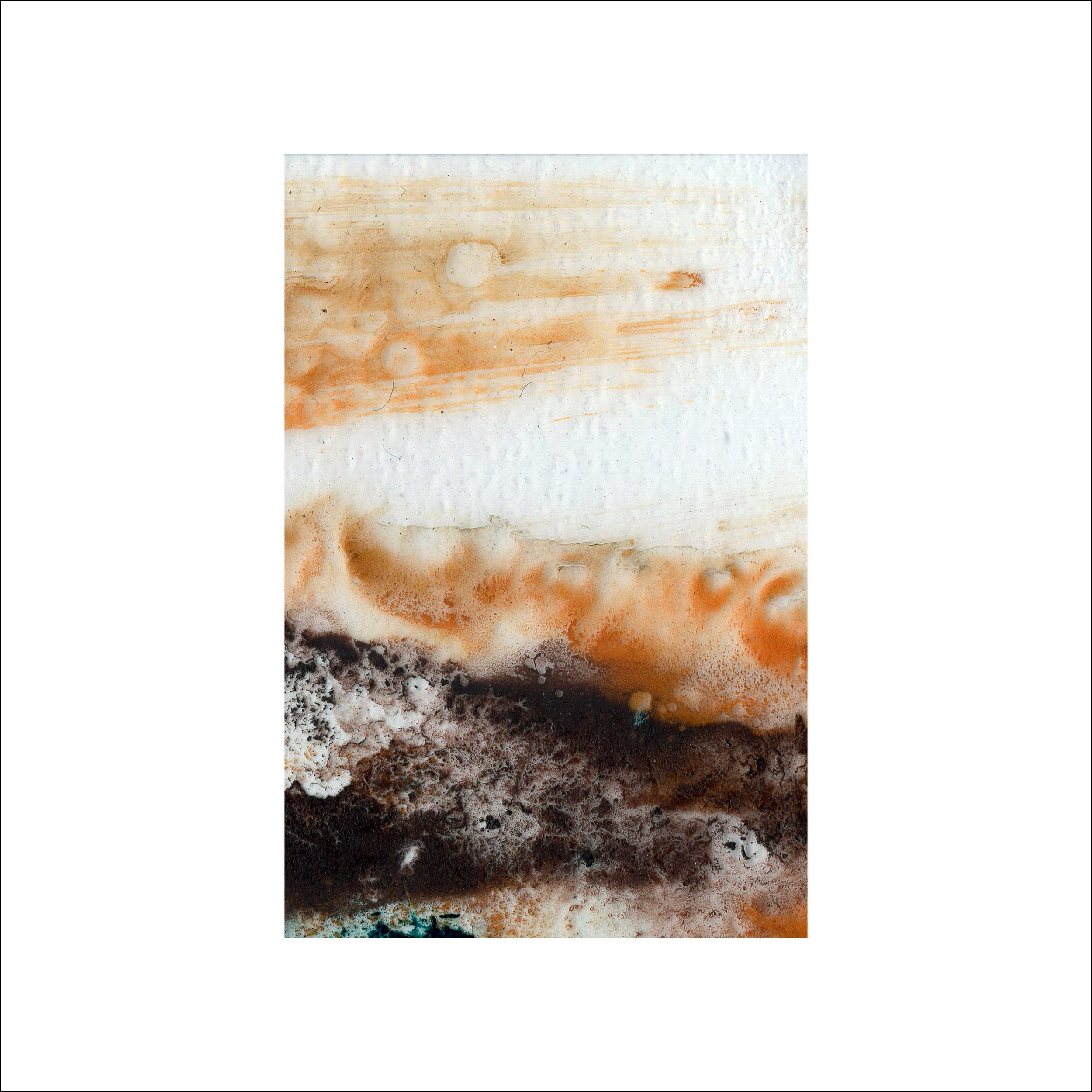
Undocumented acetate sheet - soon to be Abstracted 35 Set 8
An overlooked experiment
This led me to one of the sheets on the shelf – I had overlooked it because in my mind it was quite garish, with loud orange marks overshadowing any of the other colours It also felt ‘too loose’, a fairly personal and abstract definition, which I think means that it wasn’t pleasing to look at.
This value judgement was enough to keep me away from it, to confine it to history, unseen. In a quiet moment in the studio I decided to scan it with the usual grid behind at 1200dpi, far removed from my usual 4800dpi.
The main benefit of this is that I could scan the whole image quickly – it usually takes around five minutes to high resolution scan each 24mm x 36mm image.
Delving into the minutia
Working in this less time intensive way freed me to break down the whole image into some of the smaller versions quickly while also following one of my (self-imposed) rules which is that images can only be taken as part of the grid, there is a reason for that but I fear it might take another couple of blog posts so I’ll park it for now.
What fascinated me was that by going down to the scale I like to work at removed some of the loudness that put me off from working with this image in the first place, the orange became structural, giving form that allowed some of the accent blues, greens and pinks space to breathe.
A selection of new images for consideration
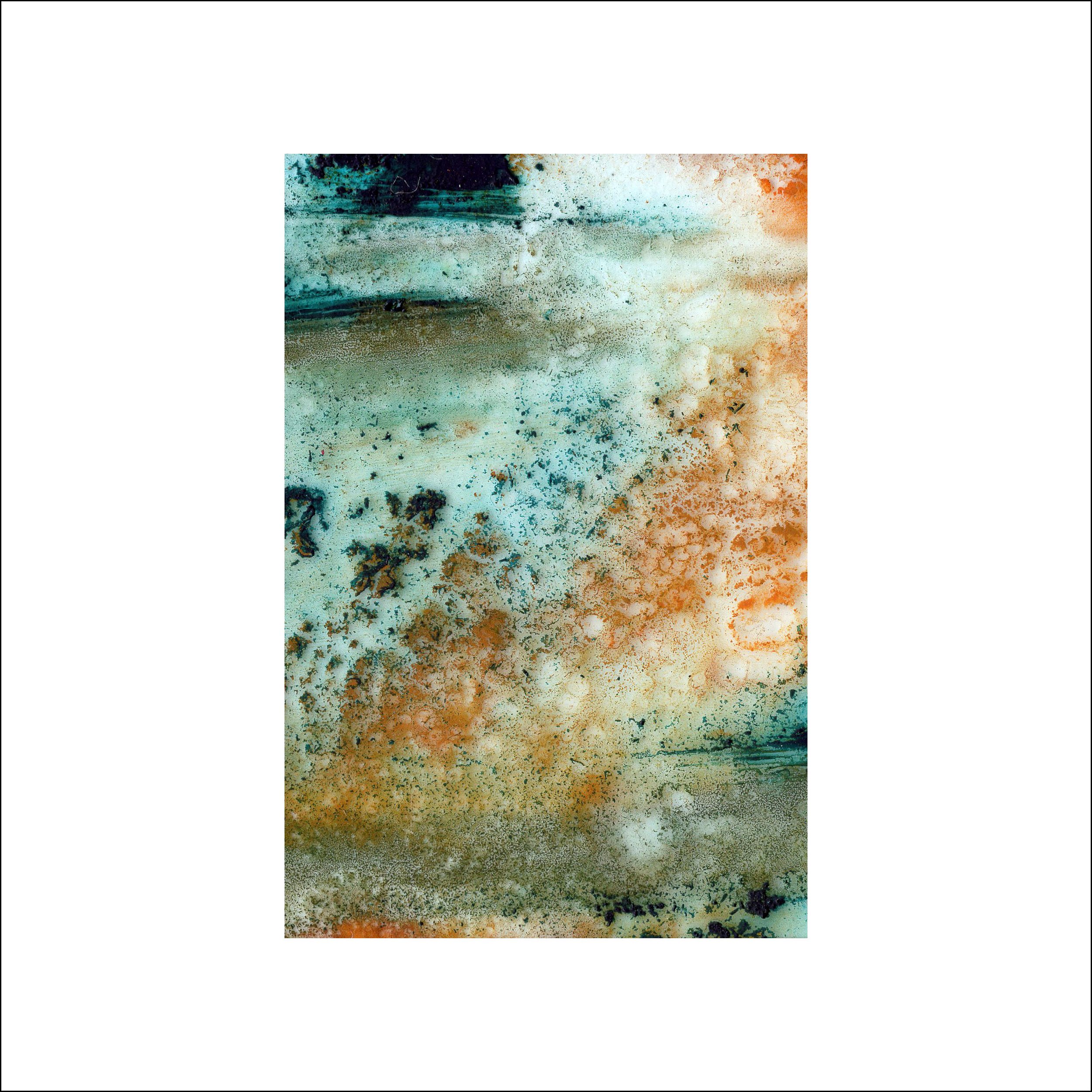
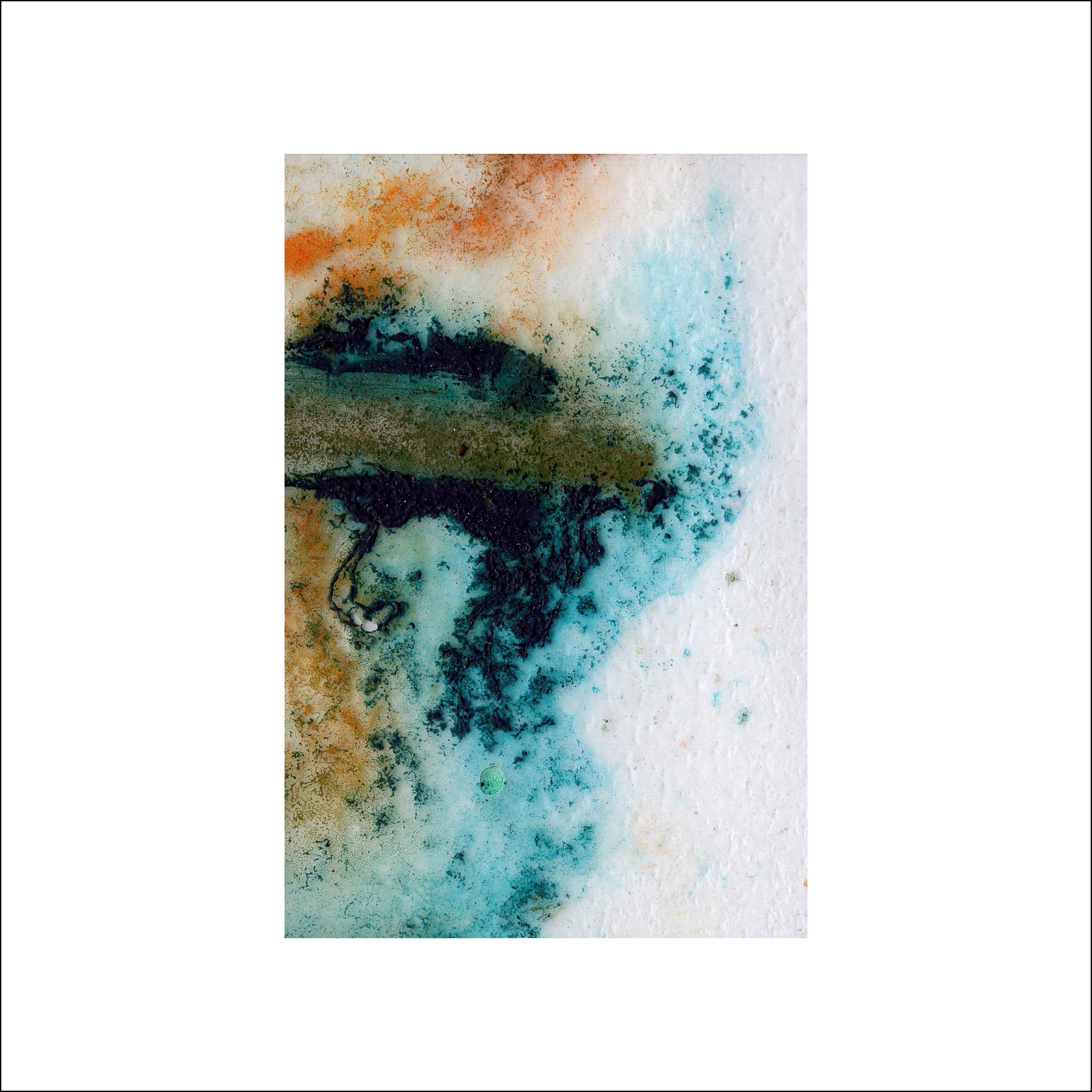
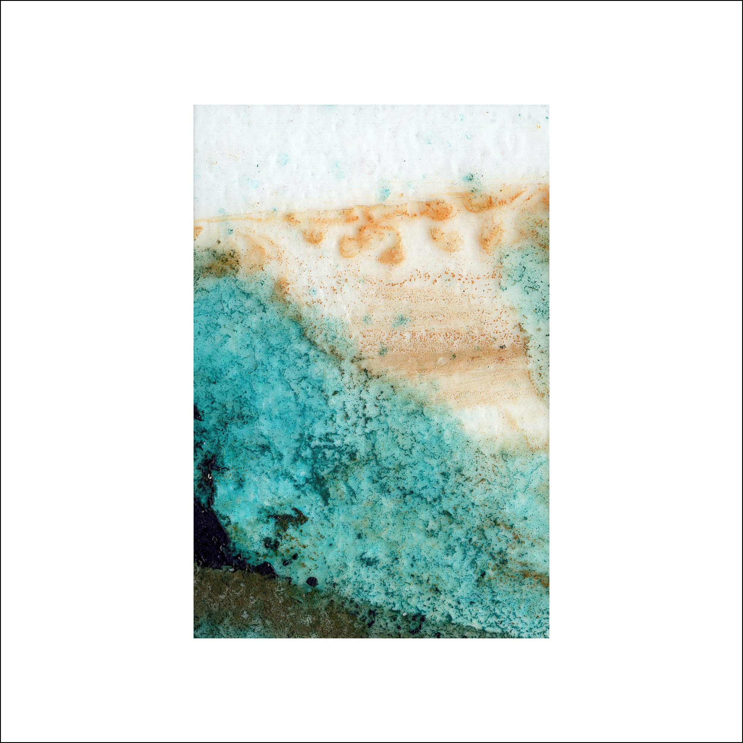
Suddenly I felt my reticence subside as I discovered images that held my attention, I was able to see the potential for beauty in some of the new images – some not so much as they were a bit muddy (if that can be considered the technical term?)
Valuing and learning from judgement
So I’m back where I started, thinking about a value judgment, there is enough substance in the images that I am going to proceed to the high resolution scanning with a more open mind. Ultimately it might always be ‘the garish series’ and that’s probably ok particularly in the divergent details in the previous series that range from simplistic, colourful and textural, go to the Abstracted 35 series page to have a look at the documented sets.
This, I think, is one of those lessons that recurs, it comes to the foreground and gradually recedes as time passes, waiting in the wings to remind me that part of my practice is about challenging materials to see what might emerge. In this context the whole sheet is meaningless, it’s a carrier for layers of process until it reaches a stage that I’m happy with, it’s a by-product rather than something in itself. It should come as no surprise to me that I will find inspiration in the minutia rather than the whole, I’ll keep this in my mind until the next diversion hits, focussing on discovering, exploring and revealing beauty, whether it is universal or comes from personal judgment.
Does this resonate with you?
If this blog post resonates to your own ways of making new work, particularly the abstract, then have a look at the Re/Defining Abstraction Research project that I’m undertaking with a view to trying to understand some of the decisions and judgements made by artists when work. I’d love to hear from you if you are interested.